CASE STUDY
Role
Product Designer
Team
3 Designers
As the project evolved, I took ownership of the work, consolidating the Style Guide and expanding the UI Library to support the platform’s growth.
Responsibilities
Establish the design foundations for the platform; Define visual and interaction patterns for consistency across the product; Identify usability issues and improve interface clarity; Collaborate with developers to support implementation and scalability
Context
ECOS is an internal platform developed for DBC Company, a technology firm that provides IT outsourcing, consulting, and digital product development services for organizations across multiple industries.
Over time, ECOS grew organically, resulting in fragmented interfaces, inconsistent components, and unclear interaction patterns across the platform. Different modules followed their own visual and structural logic, making the system harder to use and maintain.
These inconsistencies created usability challenges and contributed to a high volume of daily support tickets from internal teams.
When the company later introduced a new visual identity, updating ECOS became a priority. Rather than simply updating the interface visually, this project became an opportunity to establish a more consistent and scalable design foundation for the platform.
The Challenge
Create a scalable design foundation that improves usability, ensures consistency across the platform, and accelerates future product development.
Diagnosis
Before starting the redesign, we mapped the platform to understand its structure, permission levels, and key user flows. This analysis revealed that many usability issues were not isolated problems, but symptoms of deeper inconsistencies in the interface.
Across the platform, similar elements were implemented in different ways — from buttons and colors to tables, navigation patterns, and interaction behaviors. As the system evolved without a consistent design foundation, each module developed its own visual logic.
This fragmentation made the platform harder to learn, less predictable to use, and more difficult to maintain from both a design and development perspective.
Key Challenges
UI inconsistencies
Different visual patterns, component styles, and layout structures across modules.
High flow complexity
Workflows lacked clear structure, making tasks harder to understand and complete.
Usability issues
Inconsistent behaviors and visual cues created confusion and increased reliance on support.
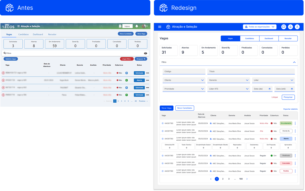
SYSTEM SCREENSHOTS

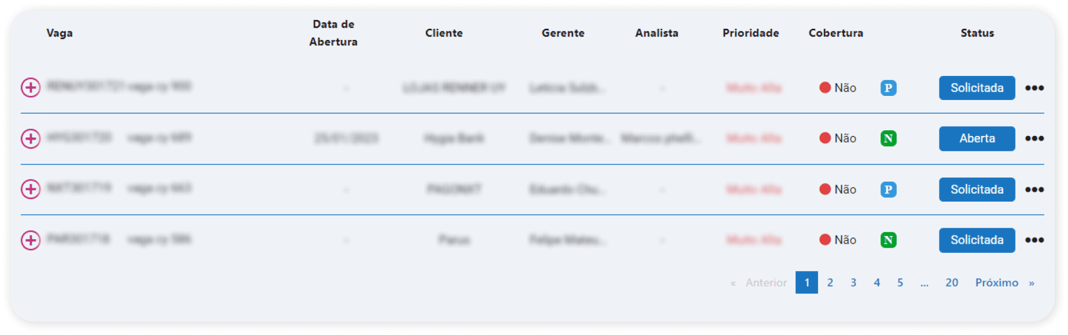
At first glance, it would be hard to tell that both listing examples belong to the same system, right? These two screens come from different user flows, and their layout choices follow no clear pattern — resulting in a lack of visual unity across the platform
SYSTEM SCREENSHOTS

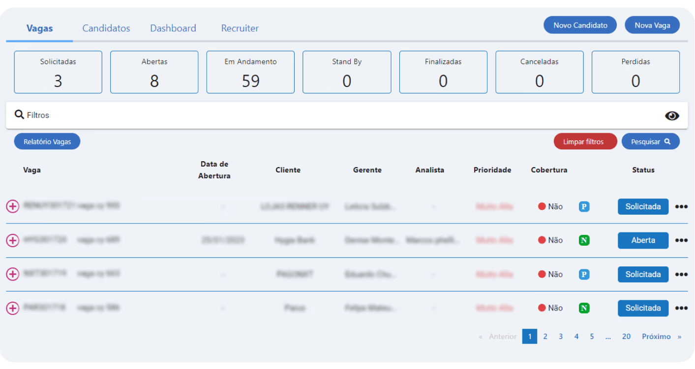
These two screens belong to the same feature, yet they show noticeably different visual styles. We can see variations in typography and component usage — both include counters, but each implements them in a different way.
Strategic Direction
While the initial goal was to update the interface visually, the diagnosis revealed that the real issue was structural: the absence of shared design foundations.
Instead of solving inconsistencies screen by screen, we proposed creating a Style Guide and UI Library to establish consistent patterns and support the platform’s long-term evolution.
Strategic Decisions
Addressing these problems screen by screen would likely recreate the same inconsistencies over time.
Instead of addressing these issues screen by screen, we proposed creating a Style Guide to establish consistent visual and interaction patterns across the platform.
While this decision expanded the project’s original scope, it established a clear foundation for more cohesive and scalable design decisions.
PRESENTATION SCREENSHOTS

As the project evolved, I took ownership of consolidating these guidelines and expanding them into a structured UI Library, enabling the platform to scale more consistently.
Together, these artifacts created a shared foundation for designers and developers, reducing inconsistencies and enabling the platform to evolve more efficiently.
Building the Design Foundations
To establish a consistent design foundation, we analyzed widely adopted frameworks such as Material Design and Bootstrap, as well as style guides from other digital products to identify proven interface patterns and best practices.
The Style Guide was created in Figma with a focus on three key principles:
clarity in visual hierarchy and interaction patterns
accessibility and readability across the interface
technical feasibility for efficient implementation
Continuous collaboration with the development team ensured that each guideline and component could be realistically implemented, aligning design decisions with the platform’s technical constraints.
This process allowed us to move beyond a simple visual redesign and establish a more structured and scalable foundation for the product.
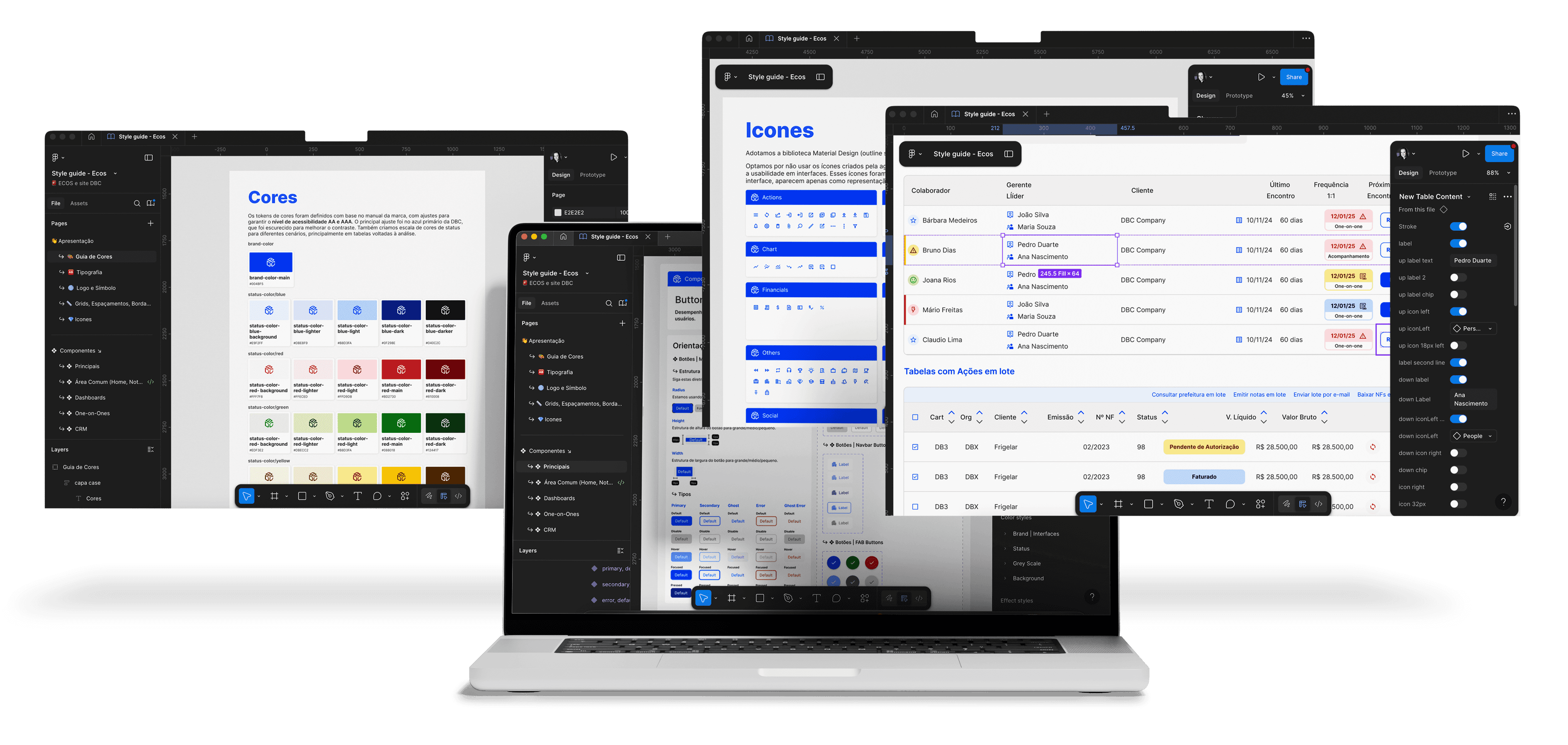
Style Guide Structure

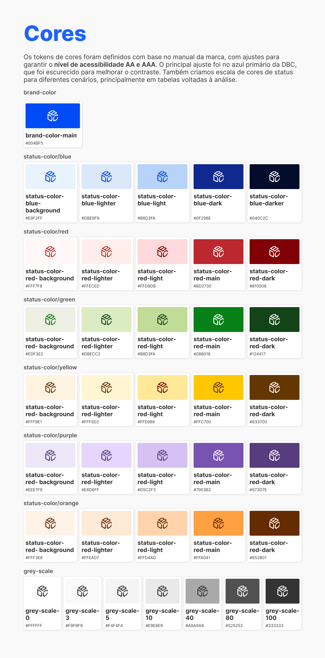
Colors
Color tokens were defined based on the brand guidelines and refined to meet WCAG accessibility standards. The primary brand blue was adjusted to improve contrast and readability across the interface. A structured status color scale was also introduced to support data-heavy views such as tables and dashboards.
STYLE GUIDE OVERVIEW
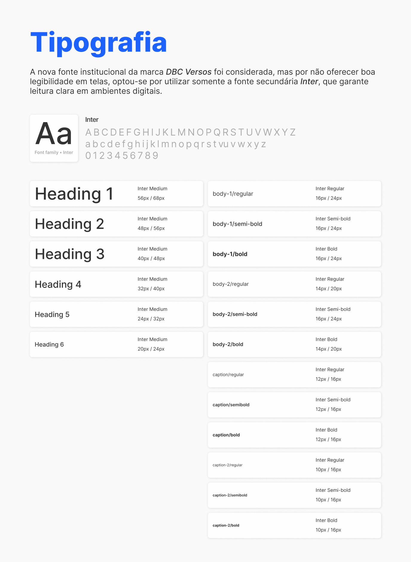
Typography
Although the brand introduced a custom institutional typeface, it presented legibility limitations in digital contexts. For the product interface, we adopted Inter, a more readable and accessible typeface for screen-based environments.
STYLE GUIDE OVERVIEW
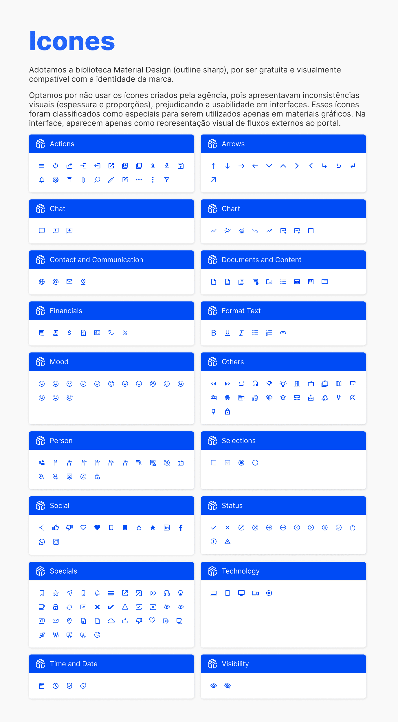
Icons
To ensure visual consistency and scalability, we adopted the Material Design icon library. The icon set provided by the branding agency presented inconsistencies in stroke weight and proportions, so it was reserved only for specific visual contexts outside the core interface.
STYLE GUIDE OVERVIEW
STYLE GUIDE OVERVIEW
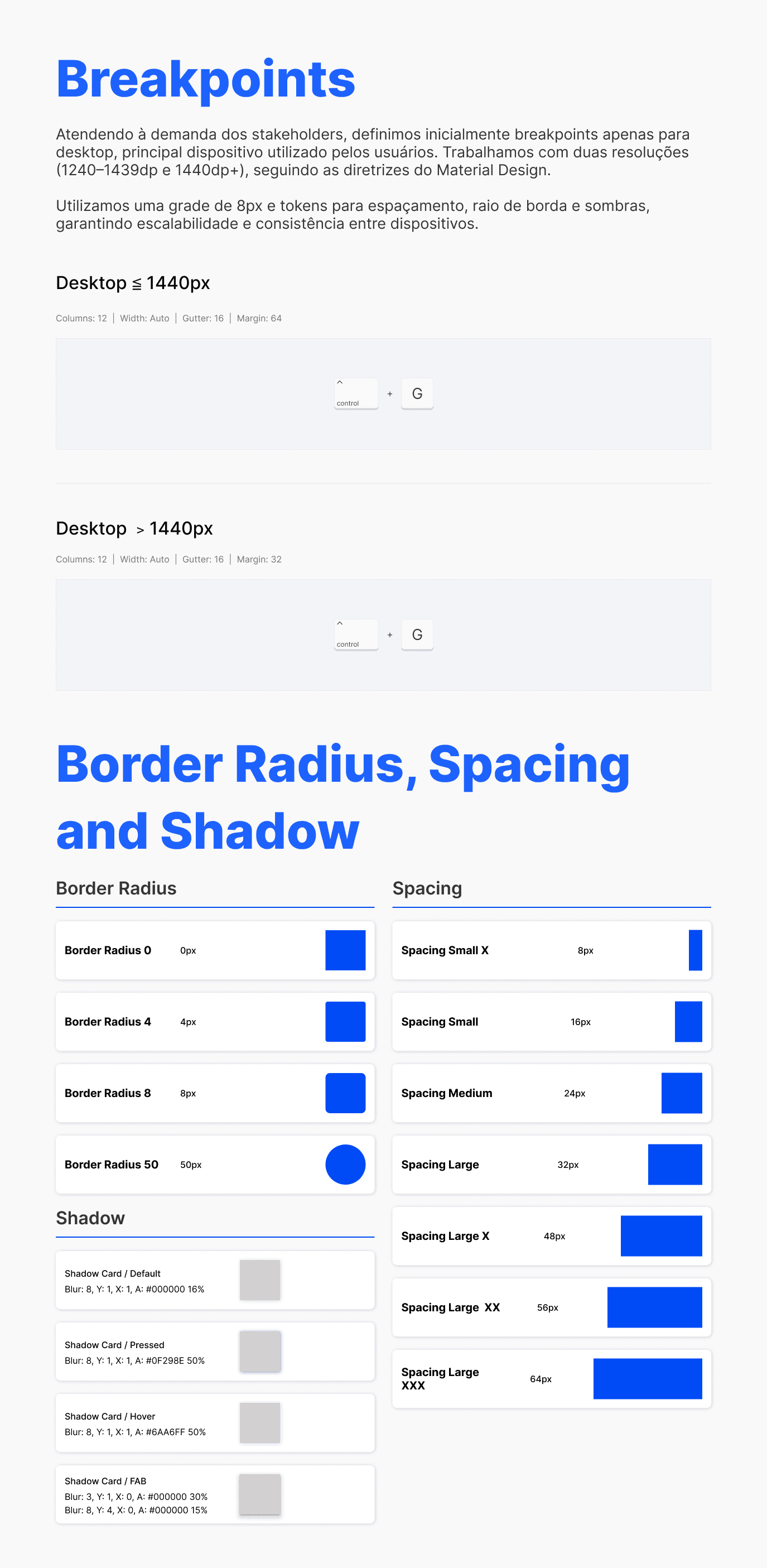
Layout Structure
We introduced a consistent layout system based on a responsive structure and an 8px spacing grid, ensuring predictable spacing, alignment, and scalable layouts across the platform.
STYLE GUIDE OVERVIEW
UI Library & Components
While the Style Guide defined the design principles, the UI Library translated those principles into reusable components.
Components were structured from foundational elements to more complex interface patterns, ensuring consistency in behavior, states, and interactions.
Each component included defined variations and interaction states, enabling designers and developers to build interfaces more efficiently while maintaining a consistent user experience across the platform.
This approach reduced the need for one-off interface solutions and accelerated the creation of new screens and features.
UI LIBRARY OVERVIEW
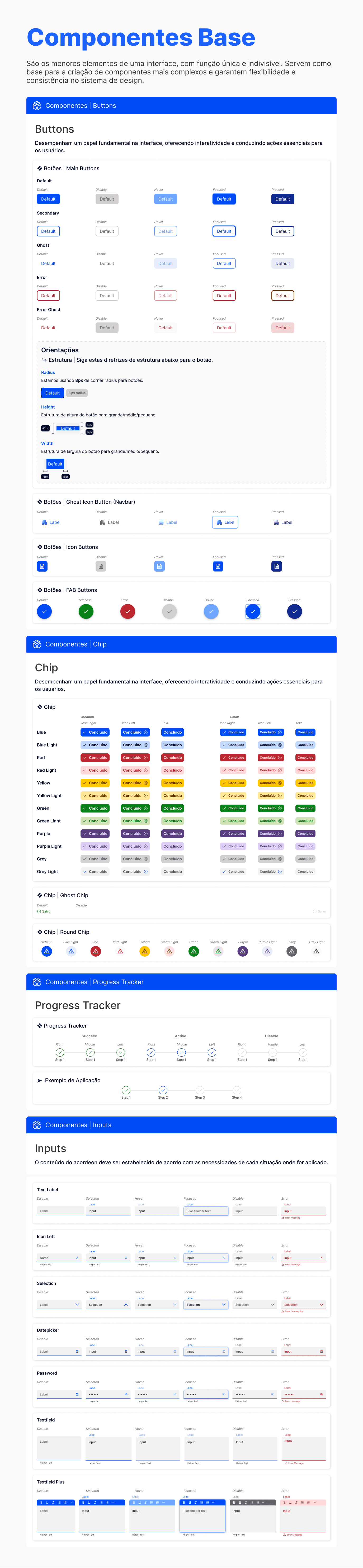
UI LIBRARY OVERVIEW

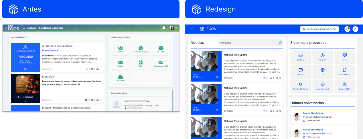
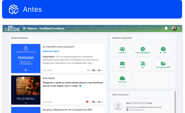
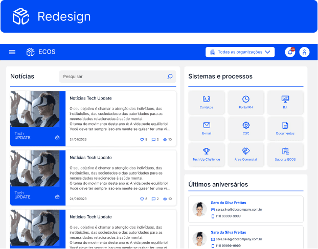
Applying the Design System
With the design foundations established, we began applying the new patterns to key areas of the platform.
Core screens used by most users were prioritized, allowing the new visual language and interaction patterns to quickly improve the everyday experience of internal teams.
The redesigned interfaces introduced clearer hierarchy, more predictable interactions, and greater visual consistency across the platform.
HOME RELAYOUT

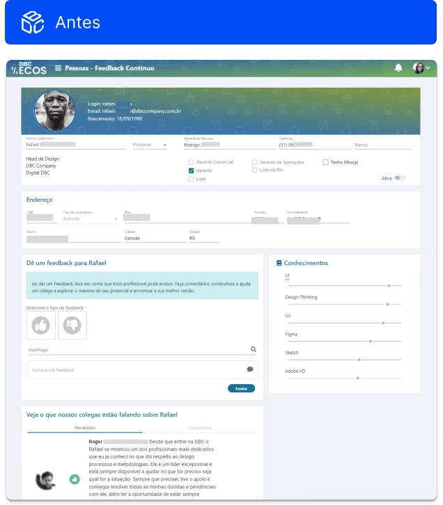
PROFILE


RECRUITMENT WORKFLOW


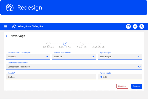
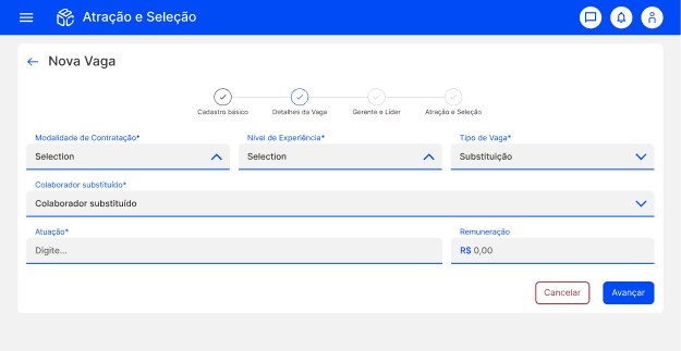
REGISTRATION FLOW


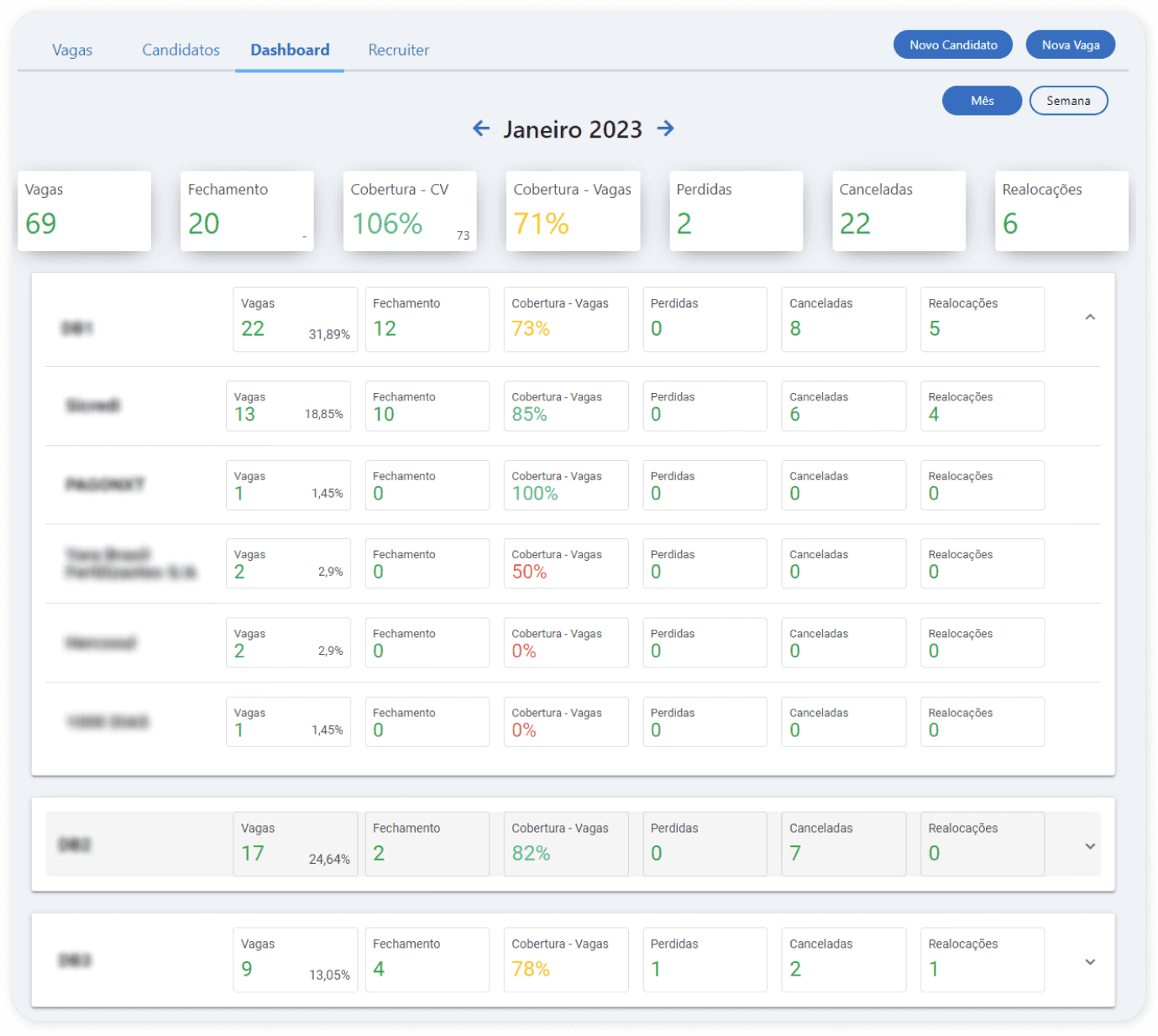
Impact & Results
The introduction of a structured Style Guide and UI Library significantly improved both the usability of the platform and the efficiency of the product team.
Product Impact
Reduced usability issues through consistent UI patterns
More intuitive and predictable interfaces for internal users
Lower learning curve across different modules
Operational Impact
Decrease in daily support tickets related to UI confusion
Faster development of new features due to reusable components
Reduced rework across design and development cycles
Organizational Impact
Increased design maturity within the company
Earlier involvement of UX/UI in new product initiatives
Stronger alignment between design, product, and engineering teams
The Style Guide established a solid foundation for the continued evolution of ECOS and laid the groundwork for the future development of a full Design System.
Lessons Learned
Design foundations enable long-term scalability
Establishing a shared design foundation early helps prevent fragmented interfaces and enables products to evolve more consistently over time.
Design maturity grows through collaboration
Close collaboration between design and development was essential to transform guidelines into practical, implementable solutions.
Small structural decisions create lasting impact
What started as a visual redesign became an opportunity to improve usability, streamline development, and introduce a more strategic approach to design within the organization.