Portal ECOS
Beyond a visual redesign, this project was an opportunity to address usability challenges through the creation of a structured Style Guide and UI Library, bringing greater visual consistency, scalability, and supported future evolution.
ECOS's Portal
Company: DBC Company
Role: UI/UX Designer
Team: The project began in collaboration with designers Ludmilla and Tatyana, alongside the ECOS development team. As the work progressed and internal team changes occurred, I took over the project as the lead designer, being responsible for completing the Style Guide and driving the evolution of the interface.
Tools: Figma
CONTEXT
The ECOS platform is DBC’s internal system used for process management, internal communication, and support of the company’s administrative operations. It centralizes essential workflows across multiple departments — including Finance, HR, Commercial, Management, and Operations — enabling employees to complete tasks, track requests, and access important day-to-day information.
PROBLEM
DBC went through a visual identity redesign, and it was essential to reflect this new language in the company’s internal systems. This led to the need for a new layout for the Ecos Portal.
DIAGNOSIS
Before approaching the redesign, we began by mapping the entire system to gain a full understanding of its structure, permission levels, and user flows. This revealed not only its complexity but also major UI inconsistencies — from buttons and colors to tables and navigation patterns.
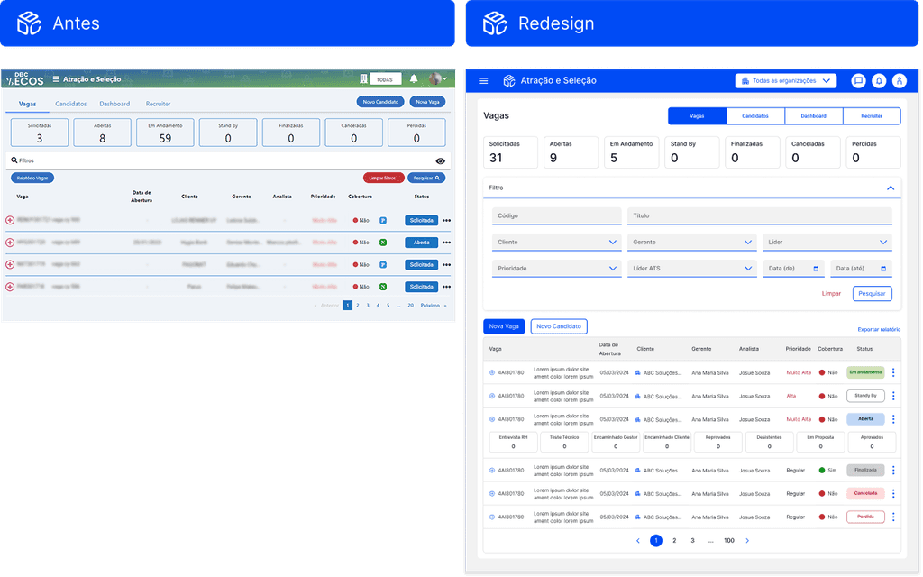
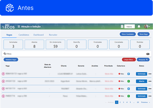
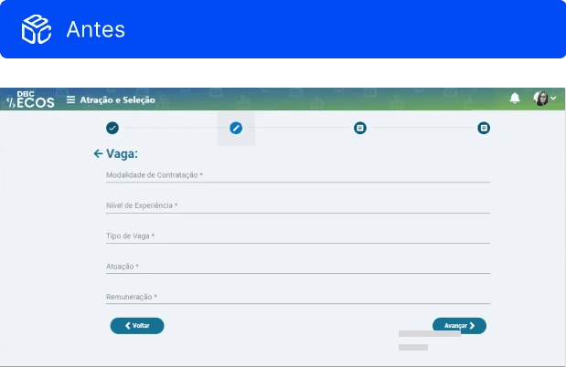
SYSTEM SCREENSHOTS
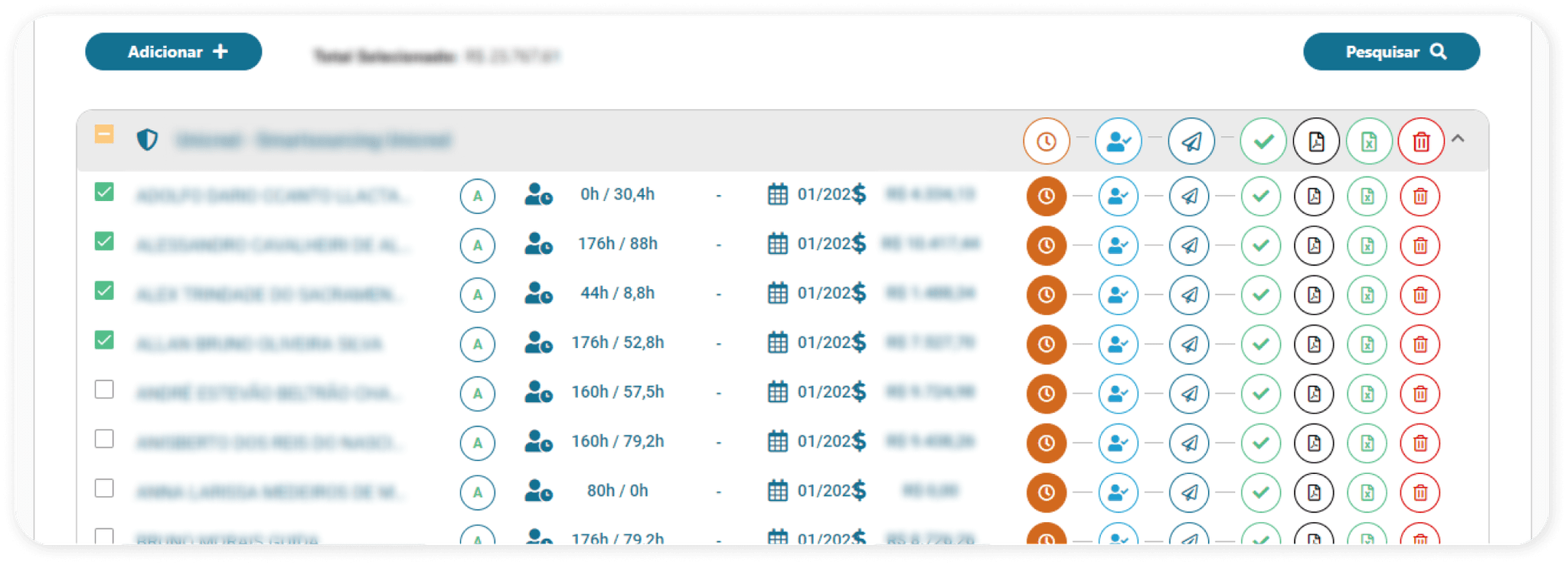
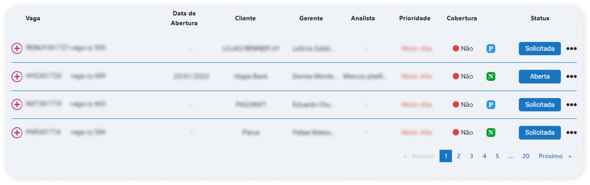
At first glance, it would be hard to tell that both listing examples belong to the same system, right? These two screens come from different user flows, and their layout choices follow no clear pattern — resulting in a lack of visual unity across the platfor
SYSTEM SCREENSHOTS
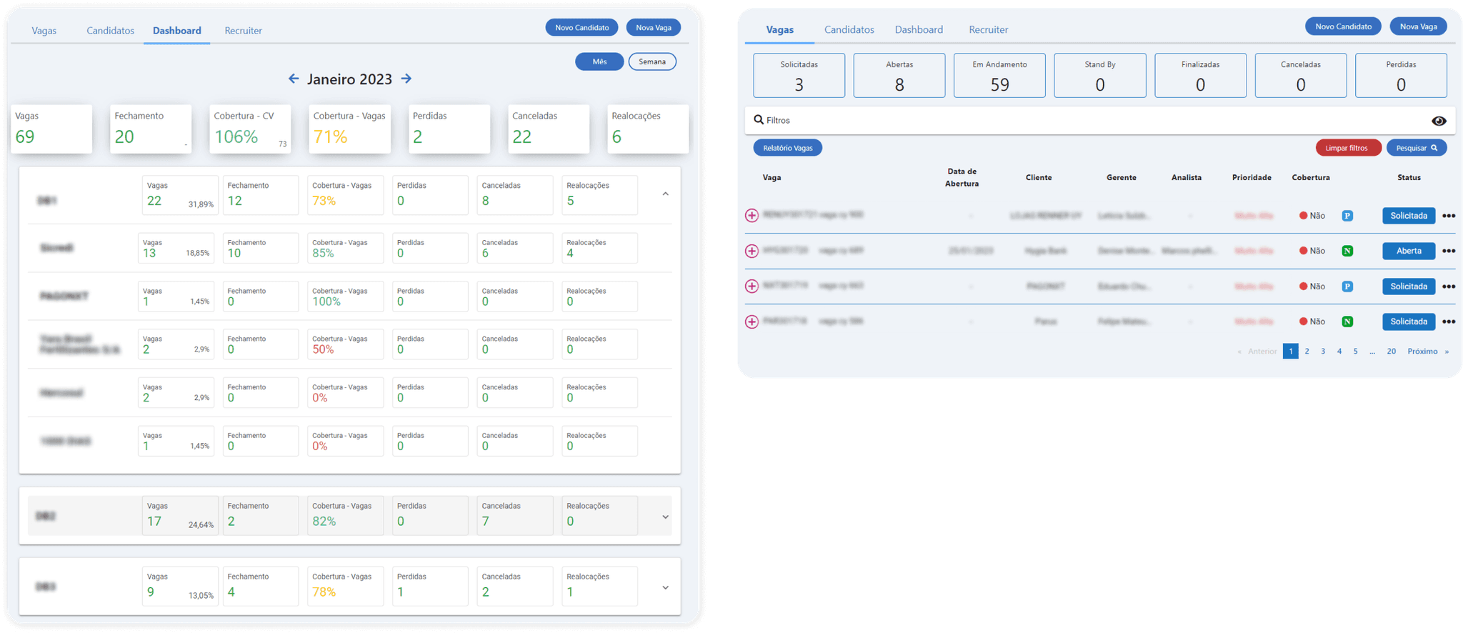
These two screens belong to the same feature, yet they show noticeably different visual styles. We can see variations in typography and component usage — both include counters, but each implements them in a different way.
HIGH FLOW COMPLEXITY
UI INCONSISTENCIES
USABILITY ISSUES
The platform had originally been developed without a dedicated designer and with a high turnover within the development team, which led to fragmented design decisions over time. As a result, the system presented several visual inconsistencies and usability issues that directly affected the user experience, leading to a high volume of daily support tickets.
SOLUTION
Although the initial scope was focused only on a visual redesign, it quickly became clear that many of the system’s usability and consistency issues stemmed from the lack of structured design guidelines.
Knowing the company didn’t yet have the maturity or resources to build a full Design System, we proposed and advocated for the creation of a comprehensive Style Guide instead as a first step. This decision required expanding the original project scope and timeline, but it brought significant long-term value, establishing visual coherence, improving usability, and creating a solid foundation for future scalability.
To ensure these guidelines translated effectively into practice, we also proposed building an accompanying UI Library. While the Style Guide would define the rules, the UI Library would turn those rules into tangible, reusable components. This approach would help the team reduce inconsistencies, accelerate development, and avoid the repeated creation of one-off interface elements — a problem that had contributed to many of the system’s inconsistencies in the first place.
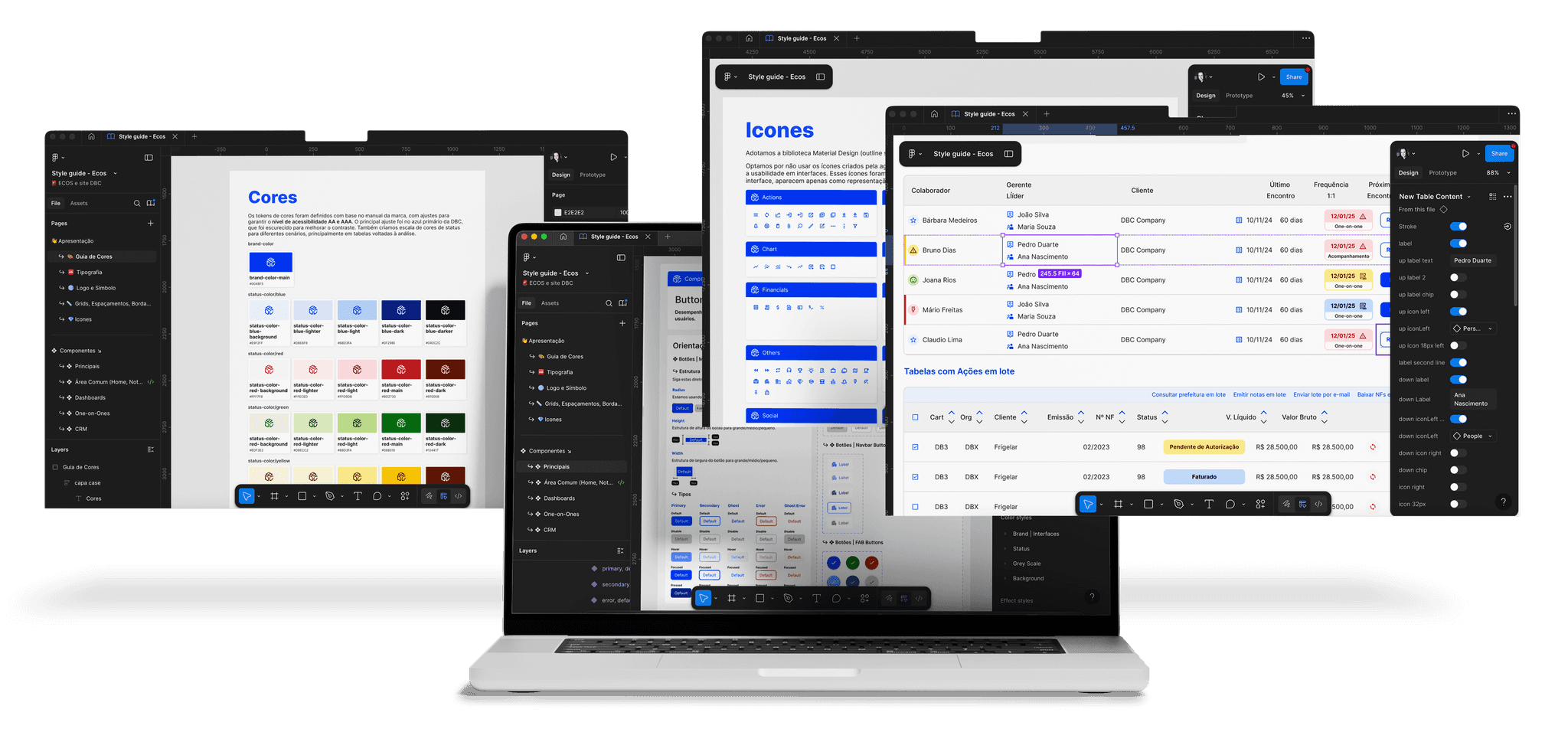
PRESENTATION SCREENSHOTS
By combining a well-structured Style Guide with a functional UI Library, we aimed to give designers and developers a clear, shared source of truth. This would not only improve the current redesign, but also make future updates faster, more consistent, and far more sustainable for the company as the system continued to grow.
DESIGN PROCESS AND RESULTS
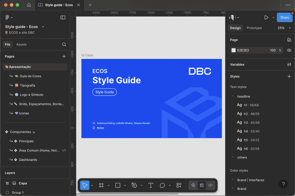
We referenced frameworks like Material Design, Bootstrap, and Component Gallery, and analyzed style guides from other companies to identify best practices. The Style Guide was built in Figma, focusing on intuitive, accessible, and technically feasible solutions.
Since the new brand identity included an inconsistent custom icon pack, we adopted a standardized icon library for the product, using the agency’s icons only in specific, special cases. We also adjusted the brand’s primary blue to meet WCAG contrast requirements and replaced the decorative headline font with the secondary typeface to ensure readability and better performance in digital contexts.
Continuous collaboration with the development team was essential to ensure each component’s technical feasibility and accurate implementation. These refinements aligned the system with usability and accessibility standards, creating a cohesive, scalable, and future-ready design foundation.
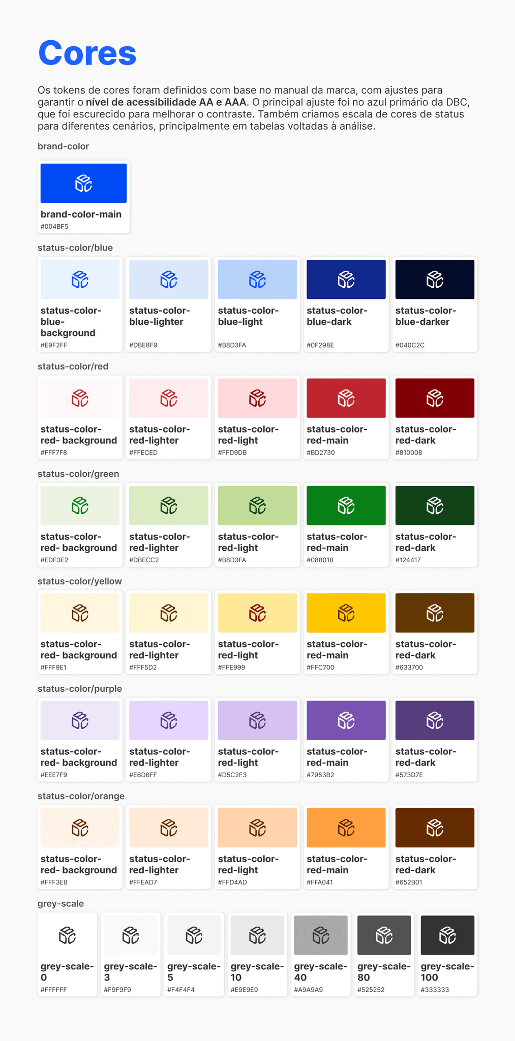
Colors
The color tokens were defined based on the brand guidelines, with adjustments to ensure compliance with AA and AAA accessibility standards. The most significant refinement was applied to DBC’s primary blue, which was darkened to achieve the required contrast ratio.
We also developed a status color scale for different use cases—especially in data-driven tables and analytical views—ensuring quick readability, clarity, and visual consistency across the system.
STYLE GUIDE'S SCREENSHOTS
TYPOGRAPY
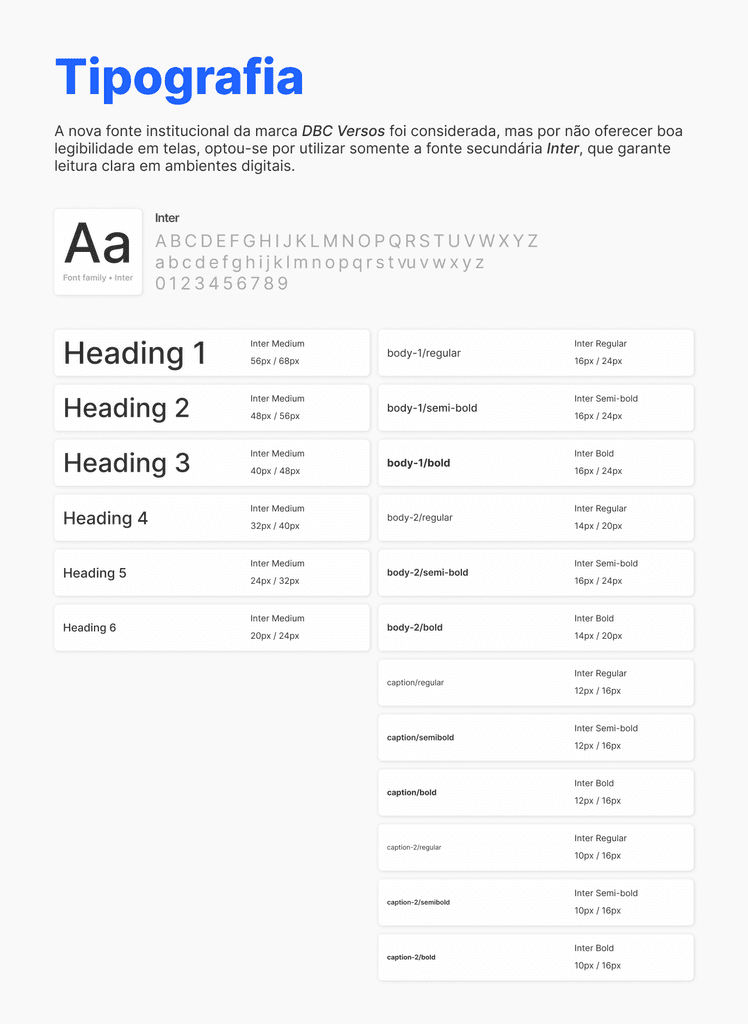
The brand’s new institutional typeface, DBC Versos, was considered; however, due to its limited legibility in digital contexts, we opted to use only the secondary typeface, Inter, which provides clearer and more accessible reading on screens.
STYLE GUIDE'S SCREENSHOTS
ICONS
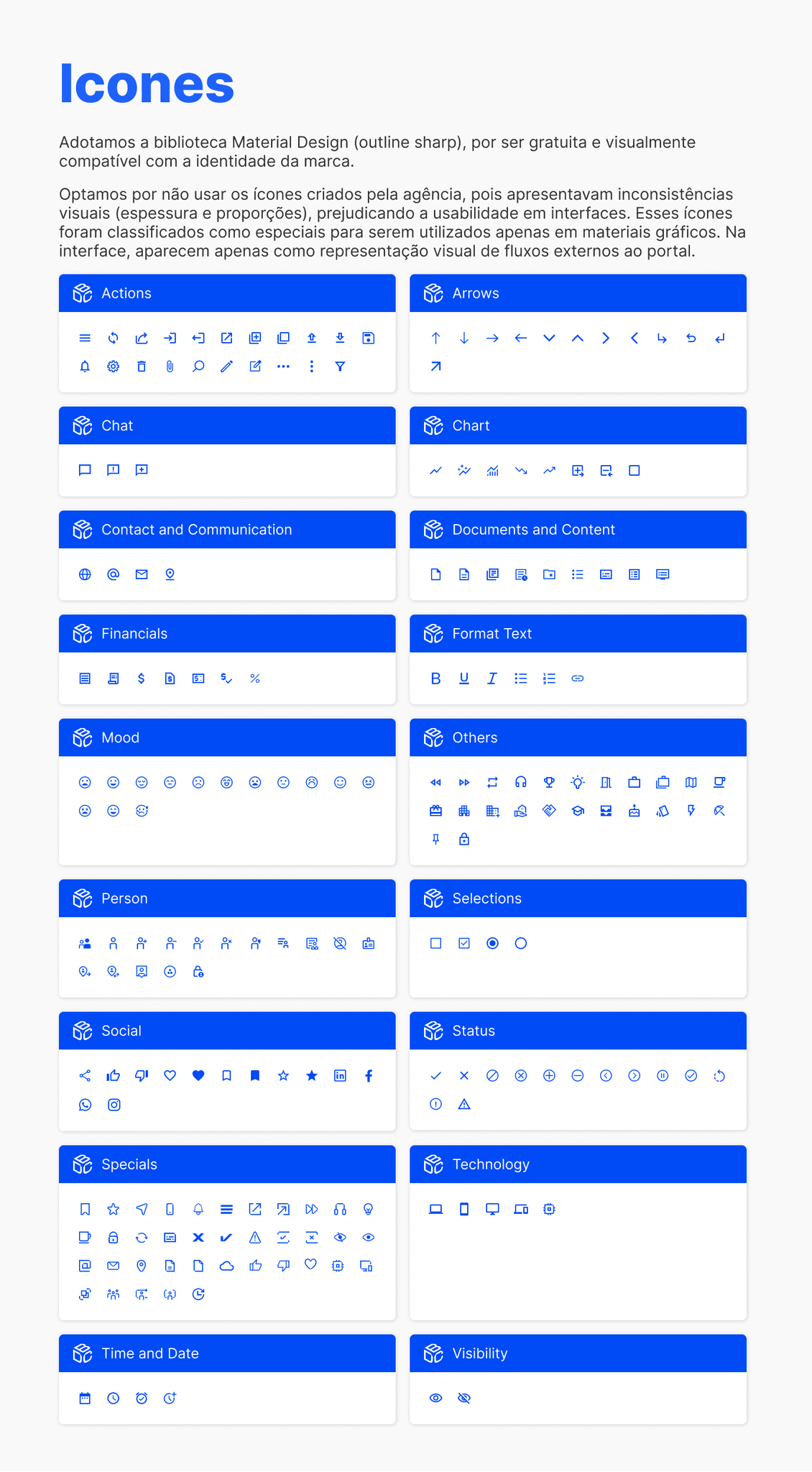
For the iconography, we adopted the Material Design (outline sharp) library, as it is free and visually compatible with the brand identity. We chose not to use the icons produced by the external agency because they showed inconsistencies in stroke weight and proportions, which could affect usability. These icons were categorized as special and reserved for graphic materials. In the interface, they appear only when representing external flows connected to the portal.
STYLE GUIDE'S SCREENSHOTS
STRUCTURE
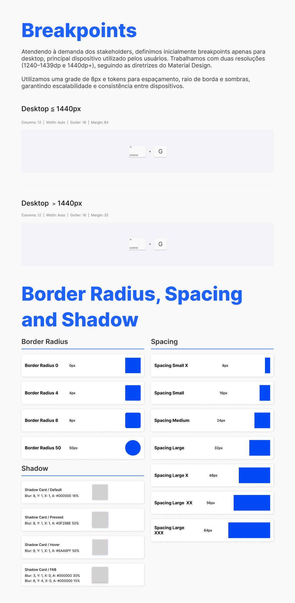
Responding to stakeholder requirements, we initially defined breakpoints exclusively for desktop—the primary device used by our users. We worked with two resolutions (1240–1439dp and 1440dp+), following Material Design guidelines.
We also applied an 8px grid and spacing, border-radius, and shadow tokens to ensure scalability, visual clarity, and consistency across devices.
STYLE GUIDE'S SCREENSHOTS
ATOMOS (Some exemples)
Atoms are the smallest building blocks of the interface — single-purpose, indivisible elements that serve as the foundation for more complex components. They ensure flexibility and consistency across the entire design system
STYLE GUIDE'S SCREENSHOTS
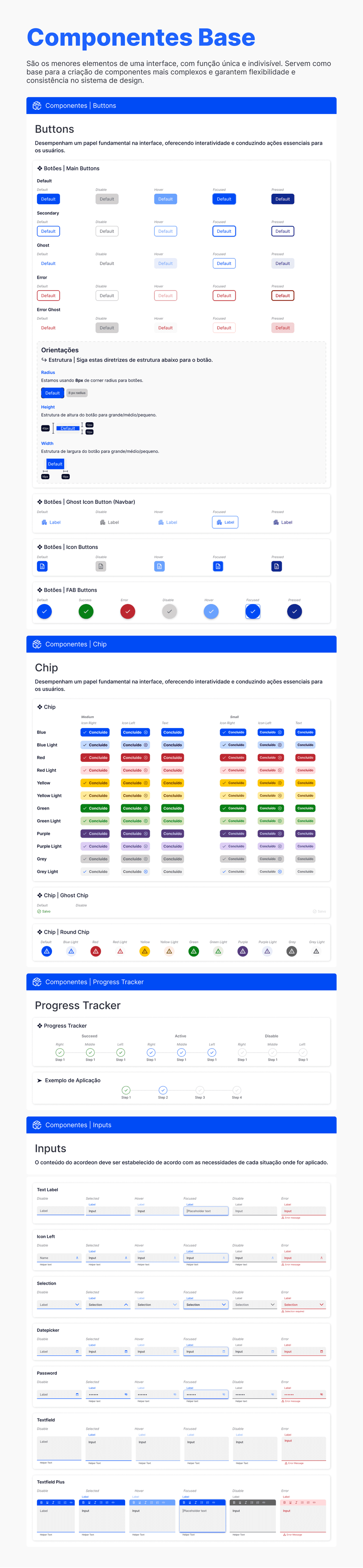
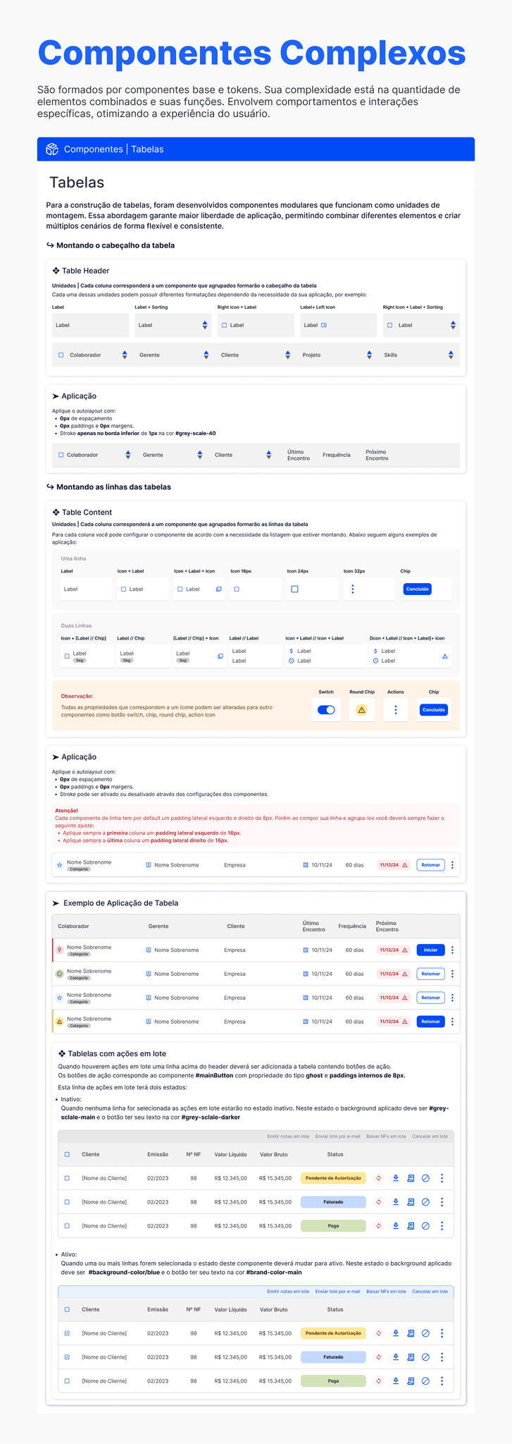
COMPONENTS (Some exemples)
Components are created by combining these base elements and their tokens. Their complexity comes from the number of elements they include and the specific roles they play. They incorporate defined states, behaviors, and interactions, helping deliver a predictable and efficient user experience.
STYLE GUIDE'S SCREENSHOTS
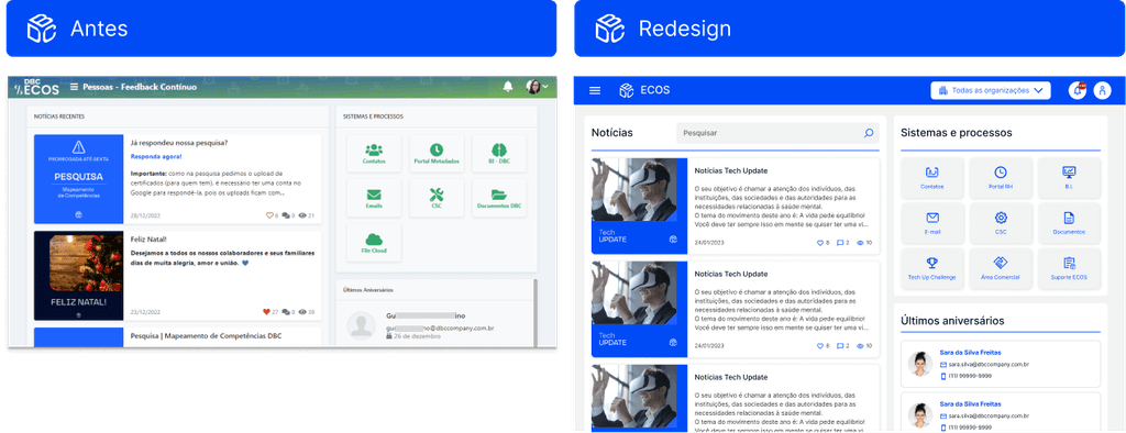
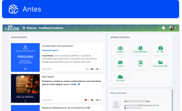
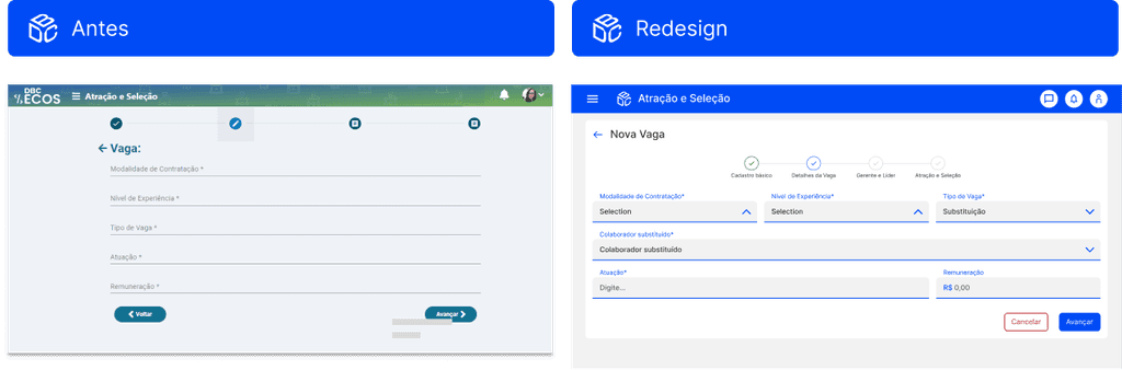
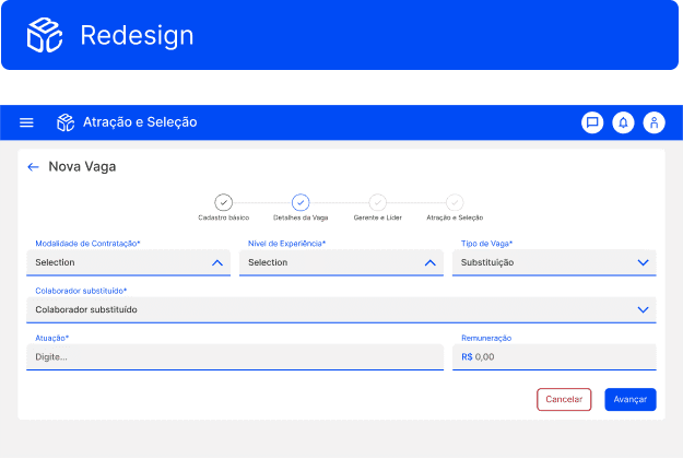
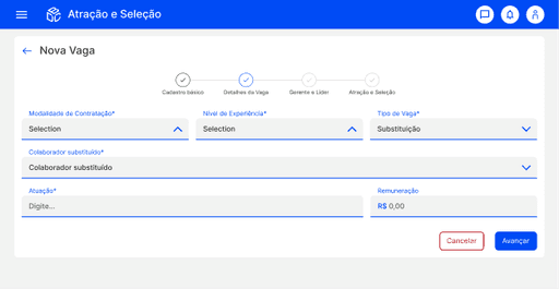
RELAYOUT
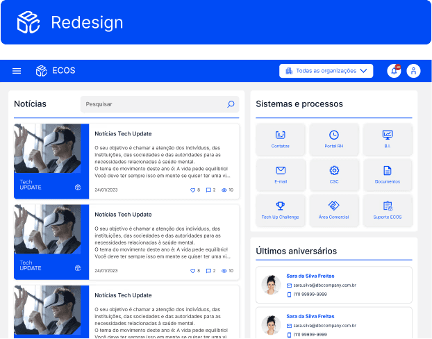
We started the redesign with the screens used by all users. Below are two examples of the updated pages.
HOME
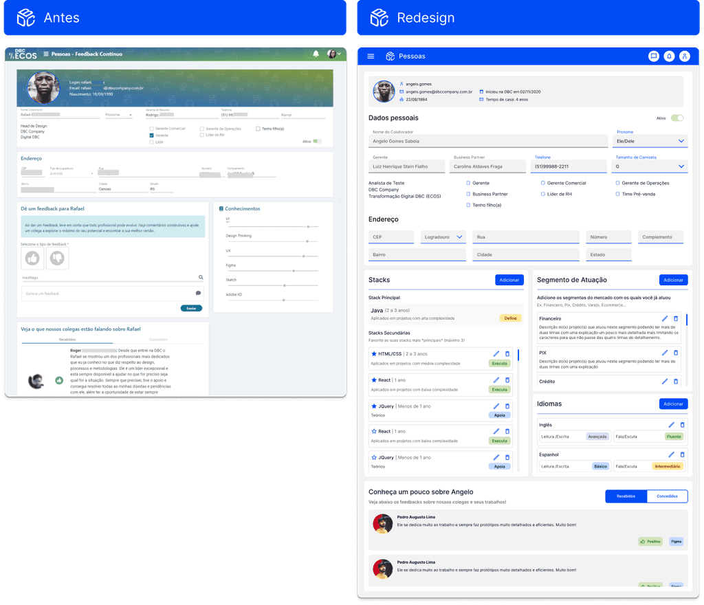
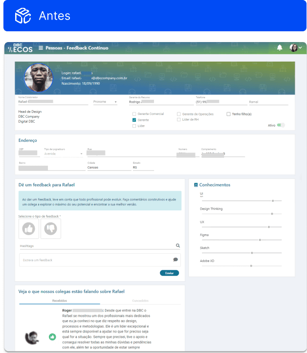
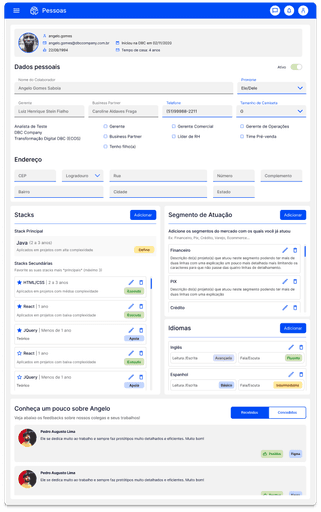
PROFILE PAGE

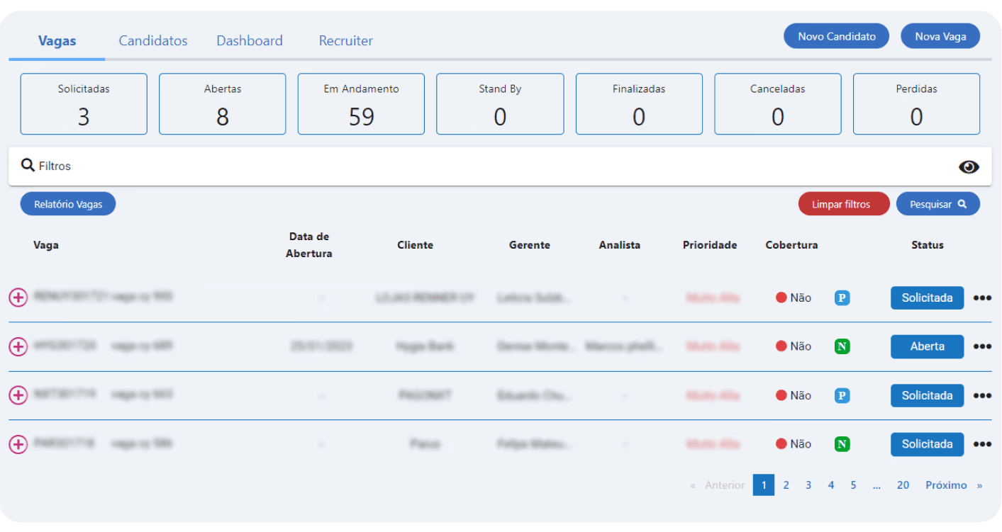
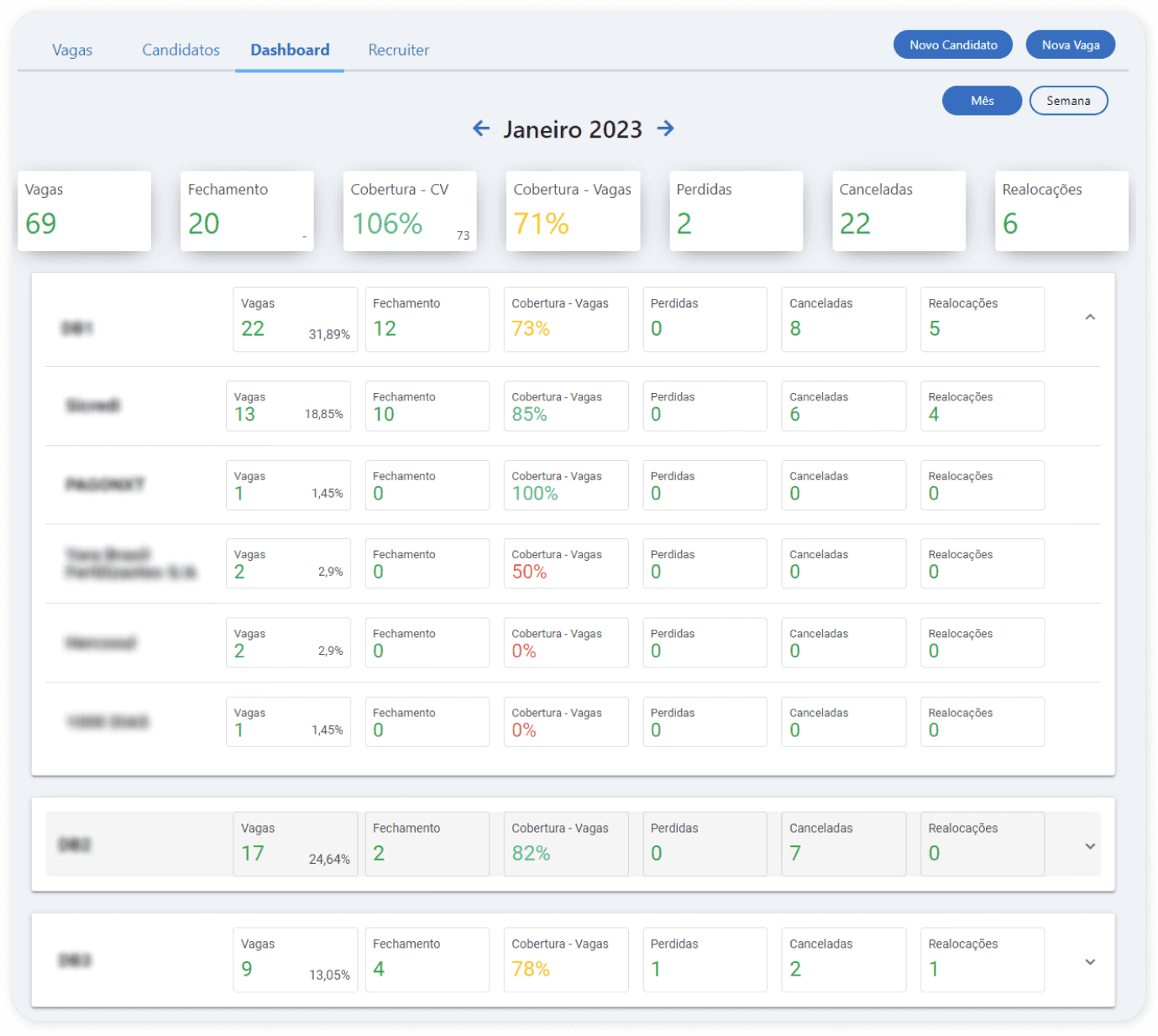
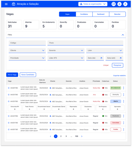
RECRUITMENT WORKFLOW
REGISTRATION PAGE
RESULT'S IMPACT
This project marked a turning point in the evolution of the ECOS platform. By redesigning key interfaces and establishing a structured Style Guide and UI Library, we significantly enhanced usability, making everyday tasks faster and more intuitive for internal teams. As a result, support requests dropped noticeably, freeing both users and support staff from recurring issues rooted in UI inconsistencies.
With a more stable and coherent foundation, the company was finally able to redirect its efforts toward building new features and addressing operational flows that had never been fully supported by the system. This expansion not only increased efficiency across multiple departments but also amplified the overall business value of the platform — transforming ECOS into a more scalable, reliable, and strategically aligned tool for the organization.
Beyond the product itself, the project reshaped the company’s approach to design. It highlighted to stakeholders the strategic impact of a well-structured design practice, leading to earlier involvement of UX/UI in new initiatives. This enabled more informed decision-making, user-centered discovery, and the development of solutions with scalable, efficient digital experiences.